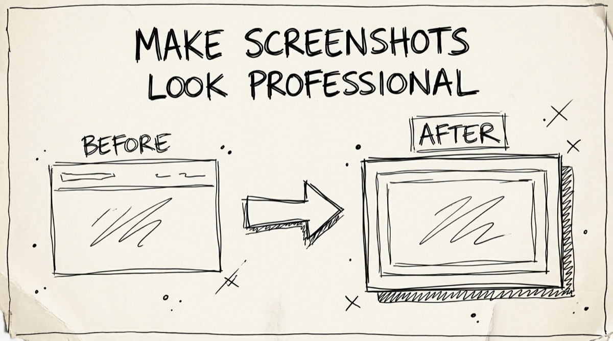
A raw screenshot is a rectangle of pixels dropped straight into a launch tweet, a changelog, or a docs page — flush against the background, no margin, no depth. It reads as unfinished, even when the product behind it is solid. The fix takes about fifteen seconds and doesn't require Figma, Photoshop, or a design background: a background, some padding, a shadow, and a rounded corner turn the same screenshot into something people actually stop and look at.
What Actually Makes a Screenshot Read Well
Beautifying a screenshot isn't decoration for its own sake — each adjustment fixes a specific reason raw screenshots look amateurish.
- Padding. A screenshot cropped tight to its edges has nowhere for the eye to rest before it starts reading. 60–120px of padding gives the image breathing room and turns it from "a crop" into "a composition." Too little and it still looks cramped; too much and the screenshot shrinks to the point of being hard to read. Start around 80px and adjust to taste.
- Background contrast. A screenshot dropped onto a white blog background with no separation blends into the page. A gradient, mesh gradient, or contrasting solid color behind it creates a visual boundary — your eye immediately knows where the "photo" starts and the page ends. This is the single biggest lever: even a flat gray background reads more intentional than none at all.
- Drop shadow. Shadow is what makes the screenshot feel like it's floating above the background instead of pasted onto it. A soft, large-radius shadow (the kind design systems call
xlor2xl) reads as "physical object with depth." A hard, tight shadow reads dated — think Windows XP drop shadows, not modern UI. - Corner radius. Screenshots are captured with hard 90° corners because that's how monitors and phone screens are shaped. Rounding them 12–20px matches the rounded-corner conventions of modern OSes and browsers, so the screenshot looks native to 2026 UI rather than like a scan from 2012.
None of these four fixes require design taste — they're mechanical. Get padding, contrast, shadow, and radius right and a screenshot looks "designed" even if you have zero design background.
Where Beautified Screenshots Actually Earn Engagement
Not every screenshot needs this treatment, but a few contexts reward it disproportionately:
- X / Twitter launch posts. A tweet with a plain, edge-to-edge screenshot gets scrolled past. A tweet where the same screenshot floats on a gradient with a shadow reads as "someone cared enough to make this," which is a proxy signal for product quality — fair or not, people use it.
- Changelogs and release notes. A wall of bullet points is easy to skim past. A beautified before/after screenshot next to the bullet makes the change concrete and memorable, and it's the difference between a changelog people skim and one they actually read.
- App Store and Play Store listings. This is the one place where store rules typically call for a device frame (an iPhone or Android bezel around the screenshot), not just a background — App Store screenshots are judged inside a phone-shaped canvas. That's a different job than a blog hero image, and it's worth knowing the tools split along this line (more on that below).
- Docs and technical writing. A raw terminal or dashboard screenshot dropped into a doc page with no framing blends into the surrounding prose. A little padding and a subtle shadow visually separates "here's a picture" from "here's more text," which makes long docs easier to scan.
How to Beautify a Screenshot with OrangeBot's Tool
orangebot.ai/tools/screenshot-beautify is a free, browser-based screenshot beautifier — canvas rendering happens locally via html-to-image, so the screenshot never leaves your device. There's no sign-up, no watermark, and no upload step to wait on. Here's the actual workflow:
- Get your screenshot in. Drag and drop a PNG, JPG, or WebP file, click to browse, or just paste directly from your clipboard with ⌘V — no save-to-disk step needed if you just took the screenshot.
- Pick a background. Four tabs: Gradient (six curated linear gradients with 8-direction control, plus radial and conic gradients), Mesh (a dozen soft multi-color mesh gradients — the "Stripe-style" look), Solid (the full Tailwind color palette, every shade of every hue), and Custom (paste any raw CSS
backgrounddeclaration if you want an exact brand color or a gradient from a generator like hypercolor.dev). - Dial in padding, corner radius, and shadow. Three sliders: padding (0–300px), border radius (0–120px) applied to the screenshot itself, and a shadow preset from
noneto2xl. The preview updates live so you can see exactly what you'll export. - Lock an aspect ratio if your destination needs one. Presets for Auto, 16:9, 4:3, 1:1, 4:5, and 3:4 cover blog hero images, OG/Twitter cards, and square social posts. Leave it on Auto if you just want padding around the screenshot at its natural proportions.
- Export. Click Copy to put the finished PNG straight on your clipboard for pasting into a tweet or doc, or PNG to download it. The tool shows you the exact output dimensions and file size before you commit.
The whole loop — drop image, pick background, adjust padding/shadow, export — takes under a minute, and because everything runs in canvas in your tab, there's no upload progress bar to wait through.
Screenshot Beautifiers Compared
Here's an honest look at where OrangeBot's tool fits against the tools that come up when you search this problem, including paid Mac apps:
| Tool | Price | Runs where | Device/browser frames | Best for |
|---|---|---|---|---|
| OrangeBot Screenshot Beautify | Free, no watermark | Browser, no upload | No | Fast, private hero images for blog/docs/X — no sign-up, no account |
| Xnapper | Free (watermarked) / $24.99–$39.99 one-time | Native Mac app | Yes | Mac users who beautify screenshots daily and want a menu-bar shortcut |
| CleanShot X | $29 one-time or ~$8–10/mo Pro | Native Mac app | Yes | Teams already using CleanShot for capture + annotation + cloud sharing |
| Shots.so | Free tier (no watermark, all frames) / $8–12/mo for higher-res & WebP | Browser | Yes | Quick device mockups (iPhone, MacBook, Android) for App Store or marketing |
| BrandBird | Free core / paid Pro for brand kits & batch export | Browser | Yes | Teams that want brand-kit consistency across many screenshots |
| Screenhance | Free (3 exports/mo) / $6 one-time Launch Pass | Browser | Yes (templates) | A single product-launch kit — App Store sets, Product Hunt gallery, OG cards |
The honest gap: OrangeBot's tool doesn't do device frames (no iPhone bezel, no browser chrome mockup) — if you need an App Store screenshot set or a MacBook-frame mockup, Shots.so, Screenhance, or CleanShot X will get you there faster. What it does instead is the 80% case — background, padding, shadow, radius, aspect ratio — for free, with nothing to install, nothing to upload, and no watermark to pay to remove. For a one-off blog hero image or a tweet screenshot, that's the whole job; you don't need a frame you'll never use.
FAQ
Do I need a device frame to make a screenshot look professional?
No, for most contexts. A device frame (iPhone bezel, browser chrome) is only strictly necessary for App Store listings and marketing mockups meant to show where the app runs. For blog posts, changelogs, docs, and social posts, a background, padding, and shadow do the actual work — that's what reads as "polished," not the frame.
Does OrangeBot's screenshot beautifier upload my image anywhere?
No. The tool renders everything locally in your browser tab using canvas (html-to-image), so your screenshot is never sent to a server. You can verify this yourself: open the tool, open your browser's Network panel, turn off Wi-Fi, and try beautifying a screenshot — it still works, because nothing was ever going out over the network.
What image formats can I use as input?
PNG, JPG, and WebP. The exported result is always a PNG, since PNG handles the sharp edges of UI screenshots and text better than JPEG's lossy compression.
Will the exported PNG stay sharp on retina displays?
Yes, in the common case. The tool renders your screenshot at its native pixel dimensions and adds padding around it, rather than scaling the source image down — so a screenshot taken on a retina display stays retina-sharp in the export. If you force a narrow aspect ratio that's smaller than your screenshot's natural proportions, the image scales down to fit inside that ratio, same as any object-fit: contain box.
What's the right aspect ratio to use — 16:9, 1:1, or Auto?
Auto (just padding around the screenshot's natural shape) is the safest default for docs and blog inline images. Use 16:9 for a blog post hero image or an OG/social card (1200×630-style crops fit inside it), and 1:1 for Instagram or a square Twitter/X post. If you're not sure, export Auto first and only lock a ratio once you know exactly where the image is going.
Can I match the background to my brand color?
Yes — use the Custom tab and paste a background CSS declaration with your exact hex or RGB values, or pick from the full Tailwind palette under Solid if you just want a close match without hand-tuning a hex code.
For the layout side of screenshot prep — cropping to the exact ratio a platform expects before you beautify — see Crop Images Online: The Complete Aspect Ratio Guide. If you're also shrinking file sizes for a doc site or CDN, Free vs Paid Image Compressors covers when the free browser tools are enough. Both, along with the screenshot beautifier, live in the free OrangeBot tools directory.