You just crossed 100K downloads, or last month's revenue quietly ticked past your rent number, and the instinct is to tell someone. A plain tweet — "just hit 100k downloads!!!" — reads like every other milestone tweet, because it is. A styled card with your app's actual numbers on it, floating over a background that looks like it belongs to your brand, reads like proof someone bothered to make something.
Why Milestone Screenshots Outperform Plain-Text Numbers
This isn't a design opinion, it's a pattern you can watch play out on any indie-hacker timeline. A tweet that says "$4k MRR this month" gets a handful of likes and a reply asking if it's real. A tweet with the same number inside a designed card — some visual hierarchy, a bit of color, a recognizable "stats card" format — gets screenshotted, quote-tweeted, and cited in "how indie devs are doing" roundup threads. Three mechanics are doing the work:
- Pattern recognition. People have seen enough MRR/downloads cards from Bannerbear, Polar, and RevenueCat's "milestone" graphics that a similarly-shaped card gets read as "this format usually means real numbers," even though nothing about the format actually verifies anything (more on that below).
- Visual anchor in a text feed. A feed of paragraph tweets is skimmed. An image stops the scroll — this is just how attention works on X, Threads, and LinkedIn, independent of what's inside the image.
- Reusability. A designed card gets reused — in a Product Hunt gallery, in a press kit, in a "wrapped" retrospective post, in a pitch deck slide — in a way a bare number in a tweet never does. You make the card once and it shows up in five places.
None of this requires the number to be dramatic. A card showing "1,240 downloads" still reads better than the same number typed into a caption, because the format itself signals intent.
What OrangeBot's Stats Card Tool Actually Does
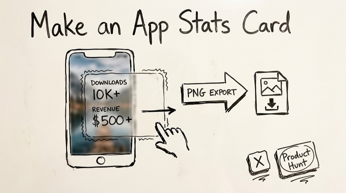
orangebot.ai/tools/appstats is a free, browser-based card maker — you supply the numbers, it handles the layout. Here's the mechanism, so you know exactly what you're getting:
- Background. Upload any photo (a screenshot, a product shot, anything), and a crop step (fixed 4:5 portrait aspect, the shape that reads well on X and Instagram) lets you frame it before it becomes the backdrop. Skip the upload and you get a default warm gradient instead.
- The card itself. A "liquid glass" panel — semi-transparent white, heavy backdrop blur, a soft top-edge shine — sits over the background. It has two fixed rows: Last Month Downloads and Last Month Revenue. You type whatever you want into both fields; there's no lookup, no API call, no verification. Defaults are
2.5M+and$1.2M+as placeholders, purely to show the layout — replace them with your real numbers. - Positioning. The card is draggable vertically over the background so you can frame it against whatever's interesting in your photo (a UI screenshot, your app icon, a product photo).
- Export. Rendering happens with
html2canvasat 4x scale, entirely in your browser tab — nothing is uploaded anywhere. You get a PNG (roughly 1500×1875px) sized for a portrait social post.
That's the entire feature set. It is not an app-store analytics dashboard, and it doesn't pull real ranking, download, or revenue data from anywhere — see the honesty section below before you use it for anything you plan to publish.
Be Honest About What's On the Card
This is worth stating plainly, because it's the one way this kind of tool goes wrong: the numbers on the card are whatever you type. OrangeBot's tool doesn't connect to App Store Connect, Google Play Console, RevenueCat, or any analytics API — it has no way to check that "2.5M downloads" is true, and neither does anyone who sees the card.
That's fine for a private mockup or a design test. It stops being fine the moment you post it publicly with numbers you can't back up. A few rules that keep this useful instead of misleading:
- Only put real numbers in. Pull the actual figure from App Store Connect, Google Play Console, or your billing dashboard first, then type it in. Don't round up "meaningfully" — 2.4M rounding to "2.5M+" is fine, 800K rounding to "2.5M+" is not.
- Pair it with proof when it matters. For a serious milestone post (a funding update, an acquisition pitch, a press kit), attach a real dashboard screenshot alongside the styled card, or at least be ready to show one if asked. The styled card is the hook; the dashboard screenshot is the receipt.
- Don't imply verification you don't have. "Just crossed X downloads" next to a card is a claim. If you wouldn't put the number in a tweet without the card, don't put it in a card either.
Treat the card as a design layer on top of numbers you already trust — not a substitute for having real numbers.
How to Make a Stats Card
- Open orangebot.ai/tools/appstats. No sign-up, no watermark.
- Upload a background image. A screenshot of your app, an icon on a solid backdrop, or any photo that fits your brand. PNG or JPG.
- Crop it. The cropper locks to a 4:5 portrait frame — drag and zoom until the part you care about is centered, then click "Crop & Use."
- Type your real downloads number into the "Last Month Downloads" field, replacing the
2.5M+placeholder. - Type your real revenue number into the "Last Month Revenue" field, replacing the
$1.2M+placeholder. - Drag the card up or down over the background until the composition looks right.
- Click Download Image. A high-resolution PNG saves straight to your device — nothing was ever sent to a server in the process.
- Post it to X, add it to a Product Hunt gallery, or drop it into a press kit or investor update.
Stats Card Tool vs. Canva, Figma, Bannerbear, and a Real Dashboard Screenshot
None of these are strictly better or worse — they're built for different situations:
- Canva. Best if you want a different layout, editable labels, or a template library beyond "downloads + revenue." Requires an account, has a learning curve past the basics, and a truly custom look takes real design time. Good for a one-off graphic you'll iterate on.
- Figma. The right choice if you're a designer building a whole brand kit (multiple card variants, a consistent visual system across launch assets) or need pixel-precise control. Overkill if you just want one card out the door in two minutes.
- Bannerbear / Orshot (API-driven card generators). Built for teams that need to generate the same card shape repeatedly and automatically — a new "milestone card" every time a metric crosses a threshold, driven by an API call instead of a human opening a browser tab. Worth it at volume; wasted setup cost for a single share.
- A real dashboard screenshot (App Store Connect, RevenueCat, Stripe). The most credible option, because it's unfalsifiable in a way any styled card isn't — but it's cluttered, exposes UI chrome and adjacent numbers you may not want public, and it's not designed to be looked at outside the dashboard it came from.
- OrangeBot's stats card tool. The right fit when you want a clean, on-brand card for two specific numbers, right now, without an account, a template search, or design software — at the cost of a fixed layout and fixed field labels (you can't rename "Last Month Downloads" to "MRR" or add a third metric).
If you need speed and privacy for a quick share: use the free tool. If you need brand flexibility or automation at scale: reach for Canva/Figma or an API tool instead.
FAQ
Does OrangeBot verify my downloads or revenue numbers?
No. There's no App Store Connect, Google Play, or payment-processor integration — you type both numbers in yourself, and the tool has no way to check them. Only enter figures you can back up.
Does my background image get uploaded anywhere?
No. Cropping happens in the browser via react-easy-crop, and the final image is rendered with html2canvas locally in your tab. Nothing leaves your device during the process.
What size is the exported image?
The card is captured at 4x scale from a 375×468.75px canvas, so you get roughly 1500×1875px — a 4:5 portrait PNG that fits X posts, Instagram posts, and most press-kit slots without stretching.
Can I change the labels to something other than "downloads" and "revenue"?
Not currently — the two rows are fixed to "Last Month Downloads" and "Last Month Revenue," and only the values are editable. If you need a different metric label (MRR, subscribers, stars), a template tool like Canva gives you that flexibility.
Do I need an account or will there be a watermark?
No account, no watermark, no usage limit. The tool is free and unmetered.
Is this the same as an app-store ranking or analytics tool?
No — it doesn't look up real ranking, download, or revenue data for any app. It's purely a layout tool for numbers you already have. For real category-level App Store leaderboard data (Top Free/Paid/Grossing by genre), orangebot.ai surfaces that separately on the homepage, sourced from daily App Store data.
Where This Fits
A stats card is a distribution tool, not a data tool — the same category as beautifying a screenshot or tagging your launch links with UTM parameters so you can actually measure whether the card drove traffic. Make the card, tag the link you post it with, and you'll know within a day whether the milestone post actually moved anyone. For the rest of OrangeBot's free browser-based tools, see orangebot.ai/tools.